Trusted to drive strategic growth for ambitious businesses. Results All Projects Filter by All Long Sales Cycles Lead Generation Brand Awareness Change Behaviour Reach New Audience Increase Revenue
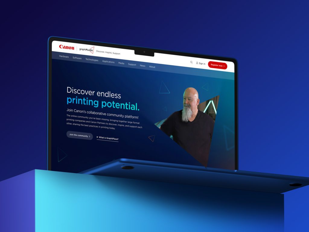
Developing and advancing Canon Production Printing’s knowledge-sharing platform to accelerate collaboration and expertise. 0 % growth in organic clicks YoY Strategy + Web + Spark What is Spark? Playtime is on us! All our ongoing marketing services include bonus Spark days that can be used with any team across the agency to create, learn and boost the performance of your marketing. This allows us to test new ways to find what works best for your business.
Long Sales Cycles Accelerating lead generation for Premier Modular with strategic digital transformation and a multisite structure 400% increase in enquiries SEO + Web + UX + Spark What is Spark? Playtime is on us! All our ongoing marketing services include bonus Spark days that can be used with any team across the agency to create, learn and boost the performance of your marketing. This allows us to test new ways to find what works best for your business.
Long Sales Cycles Accelerating lead generation for Premier Modular with strategic digital transformation and a multisite structure 400% increase in enquiries SEO + Web + UX + Spark What is Spark? Playtime is on us! All our ongoing marketing services include bonus Spark days that can be used with any team across the agency to create, learn and boost the performance of your marketing. This allows us to test new ways to find what works best for your business.
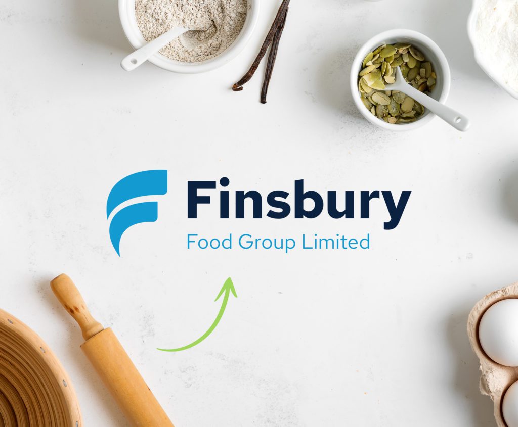
Lead Generation Refreshing Finsbury Food Group's brand and website to support long term, sustainable growth. 17% increase in direct traffic Strategy + Brand + Web + Spark What is Spark? Playtime is on us! All our ongoing marketing services include bonus Spark days that can be used with any team across the agency to create, learn and boost the performance of your marketing. This allows us to test new ways to find what works best for your business.
Lead Generation Refreshing Finsbury Food Group's brand and website to support long term, sustainable growth. 17% increase in direct traffic Strategy + Brand + Web + Spark What is Spark? Playtime is on us! All our ongoing marketing services include bonus Spark days that can be used with any team across the agency to create, learn and boost the performance of your marketing. This allows us to test new ways to find what works best for your business.
Increasing market penetration for Protect Group with a sector specific product campaign + 2,400 Unique accounts reached Strategy + Paid Social + Media Production + Spark What is Spark? Playtime is on us! All our ongoing marketing services include bonus Spark days that can be used with any team across the agency to create, learn and boost the performance of your marketing. This allows us to test new ways to find what works best for your business.
Brand Awareness Building digital authority for Dodd Group to drive growth and support recruitment. 110% increase in events per session Strategy + Web + UX & CRO + Spark What is Spark? Playtime is on us! All our ongoing marketing services include bonus Spark days that can be used with any team across the agency to create, learn and boost the performance of your marketing. This allows us to test new ways to find what works best for your business.
Brand Awareness Building digital authority for Dodd Group to drive growth and support recruitment. 110% increase in events per session Strategy + Web + UX & CRO + Spark What is Spark? Playtime is on us! All our ongoing marketing services include bonus Spark days that can be used with any team across the agency to create, learn and boost the performance of your marketing. This allows us to test new ways to find what works best for your business.
Lead Generation Increasing brand affinity and lead generation for The CFO Centre through digital transformation +50% Increase in returning visitors Web + Strategy + Media Production + Spark What is Spark? Playtime is on us! All our ongoing marketing services include bonus Spark days that can be used with any team across the agency to create, learn and boost the performance of your marketing. This allows us to test new ways to find what works best for your business.
Lead Generation Increasing brand affinity and lead generation for The CFO Centre through digital transformation +50% Increase in returning visitors Web + Strategy + Media Production + Spark What is Spark? Playtime is on us! All our ongoing marketing services include bonus Spark days that can be used with any team across the agency to create, learn and boost the performance of your marketing. This allows us to test new ways to find what works best for your business.
Transforming Visit Shropshire's digital strategy to drive membership growth and long-term tourism engagement. 0 % increase in form submissions Strategy + Web + UX & CRO + Spark What is Spark? Playtime is on us! All our ongoing marketing services include bonus Spark days that can be used with any team across the agency to create, learn and boost the performance of your marketing. This allows us to test new ways to find what works best for your business.
Brand Awareness Boosting Kara’s brand awareness, growing pipeline and strengthening partnerships through strategic marketing campaigns. +33K organic social engagement Web + Organic Social + SEO + Spark What is Spark? Playtime is on us! All our ongoing marketing services include bonus Spark days that can be used with any team across the agency to create, learn and boost the performance of your marketing. This allows us to test new ways to find what works best for your business.
Brand Awareness Boosting Kara’s brand awareness, growing pipeline and strengthening partnerships through strategic marketing campaigns. +33K organic social engagement Web + Organic Social + SEO + Spark What is Spark? Playtime is on us! All our ongoing marketing services include bonus Spark days that can be used with any team across the agency to create, learn and boost the performance of your marketing. This allows us to test new ways to find what works best for your business.
Long Sales Cycles Reinvigorating Midland Computers’ customer engagement with a multi-touch marketing reboot. 10% increase in organic search clicks Branding + Web + SEO + Spark What is Spark? Playtime is on us! All our ongoing marketing services include bonus Spark days that can be used with any team across the agency to create, learn and boost the performance of your marketing. This allows us to test new ways to find what works best for your business.
Long Sales Cycles Reinvigorating Midland Computers’ customer engagement with a multi-touch marketing reboot. 10% increase in organic search clicks Branding + Web + SEO + Spark What is Spark? Playtime is on us! All our ongoing marketing services include bonus Spark days that can be used with any team across the agency to create, learn and boost the performance of your marketing. This allows us to test new ways to find what works best for your business.