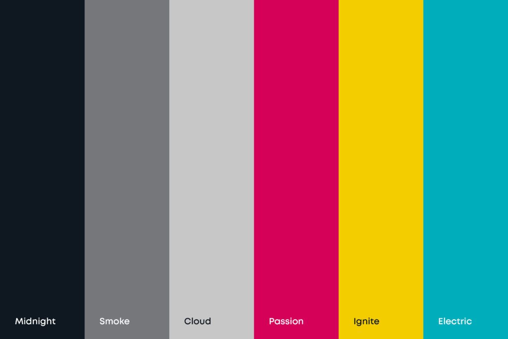
What Makes an Ideal Brand Palette?

Communicating the essence of your brand is easier said than done. Telling audiences what you do can only go so far, the right colour palette can make them feel what you do. The correct colour palette should help immediately communicate what your business does and how you do it. It is the basis from which your visual identity is built to convey your personality, values, and belonging, so you need to get it right.
Let’s take a jaunt across the branded rainbow to see how your colour palette can truly make your brand stand out.
Start with Your Brand’s Core
Before you even think about colours, it’s essential to have a solid understanding of your brand’s core values, mission, and personality. Your brand palette should be a visual representation of these fundamental elements. When creating or evolving a brand, certain initial questions need to be asked to guide your creative focus and ensure you’re hitting the right touchpoints.
- What emotions do we want to evoke in our audience?
- What values are at the heart of our brand?
- How do we want to be perceived in the market?
Questions like these, a taster of what we ask in our initial Discovery Sessions, get to the core of your brand and begin giving an insight into your brand’s essence.
Industry & Target Audience
While you want to stand out, it’s important to consider industry norms and your target audience’s preferences. Research has shown that up to 90% of an initial impression about a product is based on colour alone, and 85% of consumers say that colour is the primary influencer in their purchase decisions. This doesn’t mean you should blindly follow trends, but rather use them as a starting point for creating a unique palette that still feels appropriate for your sector.
If you want to get into the nitty gritty of choice and motivator behind colour, the psychology behind colour design is a whole other kettle of Pantone-tinted fish. Colours evoke emotions and associations. As a brief example, blue often signifies trust and stability, while red can represent excitement or urgency. Understanding colour psychology can help your brand work on a subliminal level as well as a commercial one.
Structuring Your Palette
An ideal brand palette typically consists of:
- Primary Colours (1-2): These are your main brand colours, often used in your logo and key visual elements.
- Secondary Colours (1-2): These complement your primary colours and provide versatility in your designs.
- Neutral Colours (1-2): Used for backgrounds and to balance out your more vibrant hues.
- Accent Colours: A pop of colours used sparingly to draw attention to specific elements.
Your palette should work across various mediums – from digital to print. Consider how your colours will appear on different backgrounds and in various formats. Additionally, you need to ensure that your colour combinations meet accessibility standards for readability and contrast.
Test and Document
Don’t be afraid to test different colour combinations, especially when you’re starting off. Use tools like Adobe Colours or Coolors to experiment with various palettes. Once you’ve narrowed down your options, test them in real-world applications to see how they perform.
Next step – documentation. Creating a final Brand Style Guide is crucial for maintaining consistency and building brand reliability over time. Your style guide should include:
- Hex codes for digital use
- RGB values for screen display
- CMYK values for print materials
- Pantone colours for consistent reproduction
Your Brand Style Guide should be part of your overarching Brand Guidelines – your brand’s holy grail. These guidelines house all visual elements of your brand in one place, like logo usage, style guide, typography, visual identity and digital/print guidelines. They are also home to the soul of your brand – your mission, vision, values, USPs, brand ethos and tone of voice. Brand Guidelines are crucial for businesses of all scales, they keep you consistent and professional when working externally and maintain focus and direction internally.
More Than Just Colours
An ideal brand palette is more than just a collection of pretty colours. It’s a strategic tool that communicates your brand’s personality, evokes the right emotions, and creates a memorable visual identity. By thoughtfully considering your brand’s core values, target audience, and the psychological impact of colours, you can create a palette that not only stands out but also works hard for your brand.
Our colourful in-house creative team are experts in getting to the core of your brand and creating visual identities for businesses that exceed perceptions and are designed for growth. Whether you’re looking for a brand evolution or revolution, reach out to us today to see what we can do for your brand.

