The Psychology of Colour in Branding: Choosing Colours That Connect
Colour is more than just an aesthetic choice; it’s a potent psychological tool that can considerably influence how consumers perceive a brand. Understanding and harnessing colour psychology can be the difference between a bland brand and one that leaves a lasting impression.
We know exactly what makes a brand tick and what colours serve what purpose in branding. Let’s explore some of the psychology behind colours in branding and how you can utilise your full palette to consciously and subconsciously influence audiences.
The Power of First Impressions
First impressions matter, and colour is often the first thing a consumer notices. Studies have shown that a staggering 90% of initial judgments about a product or brand are based solely on colour. This highlights the critical role colour plays in shaping consumer perceptions and forming lasting impressions. For instance, a bright, bold colour might catch the eye more quickly than a subdued hue, instantly drawing attention to a product or logo. This immediate visual impact is crucial in a crowded marketplace where brands vie for consumer attention within seconds.
Building Brand Recognition
Consistency is key in branding, and colour plays a pivotal role. A consistent colour palette across all brand touchpoints can increase brand recognition by up to 80%. When consumers see your brand’s signature colours, they should immediately think of your business. This level of recognition fosters trust and loyalty. For example, think of Coca-Cola’s iconic red or Cadbury’s unmistakable purple. These colours are deeply embedded in consumer minds, ensuring that any product bearing these hues is instantly associated with the respective brands, thereby reinforcing brand identity and loyalty over time.
Driving Consumer Behaviour
Colour psychology has a direct impact on consumer behaviour. Certain colours evoke specific emotions and associations, influencing purchasing decisions. Red, for example, is often linked to excitement and urgency, making it a popular choice for sales and promotions. Blue, on the other hand, is associated with trust and reliability, making it a common choice for financial institutions. Green is frequently used by brands looking to emphasise eco-friendliness and sustainability, while black and white can convey luxury and sophistication. Understanding these nuances allows brands to strategically select colours that align with their marketing goals and drive desired consumer actions.
Understanding Your Audience
While general colour associations exist, it’s crucial to consider your target audience. Different cultures and demographics may perceive colours differently. For instance, white signifies purity and peace in many Western cultures but is often associated with mourning in some Asian cultures. Research your audience’s preferences and cultural nuances to select colours that resonate with them. Conducting market research and focus groups can provide insights into how different segments of your audience react to various colours, ensuring that your choices are culturally appropriate and emotionally impactful.
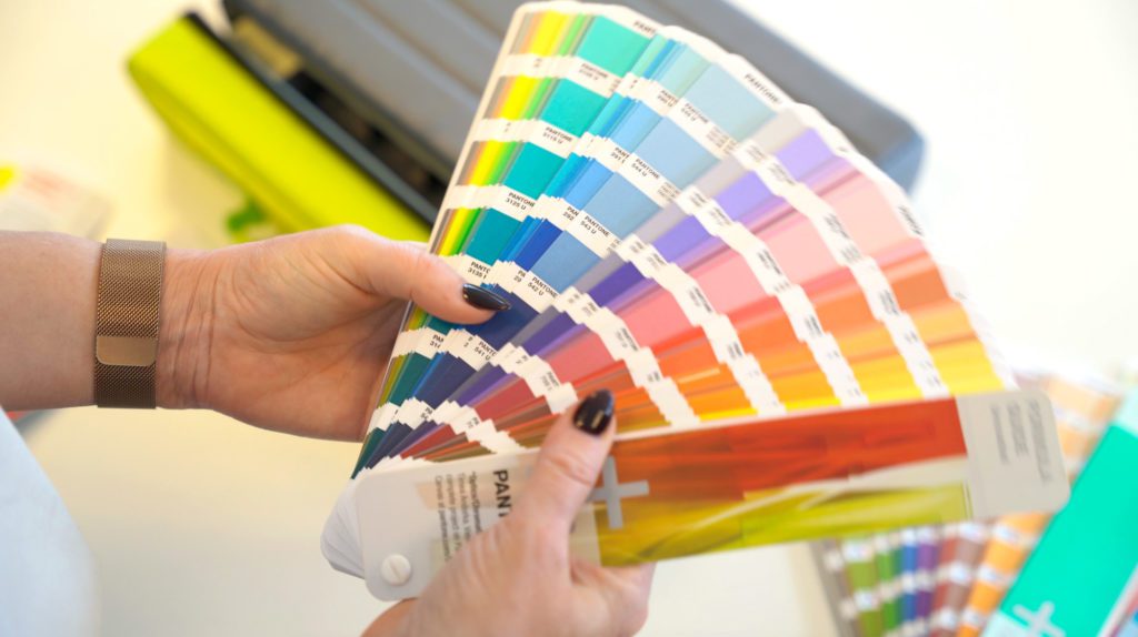
Choosing the Right Colours
When selecting colours, consider your brand’s personality and values. What emotions do you want to evoke? What message do you want to convey? Your colour palette should reflect your brand’s essence. Create a mood board to visualise your colour scheme and how it fits with your overall brand identity. Experiment with different combinations to find the perfect palette. Remember, colours should complement each other and create a harmonious visual experience. Tools like Adobe Color or Coolors can assist in creating and testing various palettes to find the most effective combinations for your brand.
The Evolution of Colour Psychology
The world of colour psychology is constantly evolving. Stay updated on the latest trends and research to ensure your brand remains relevant. Consider A/B testing different colour schemes to measure their impact on consumer behaviour. For example, you might test a call-to-action button in different colours to see which one results in more clicks. Staying attuned to changes in colour trends, such as the annual Pantone Colour of the Year, can also keep your brand looking fresh and modern.
By understanding and effectively utilising colour psychology, you can create a brand that not only looks good but also resonates deeply with your target audience. Want to chat with some experts about your current or dream brand? Get in touch today.