New website and branding for Clear Storage

We’re delighted to announce the launch of a new website and brand for Clear Storage – Hereford’s largest and most flexible storage facility.

Clear Storage, previously part of a franchise known as Beyond Storage Hereford, approached Reech to create a new brand name, look and feel for the company as well as further marketing materials and a brand-new website. This project focused on setting the new company apart from other storage facilities in Hereford.
Functional Bespoke WordPress Website for Clear Storage
The bespoke website developed in WordPress gives a smooth and functional display of the services that our client provides and incorporates the new branding designed by our team. As this website is informative to prospective clients, we designed simplistic infographics that easily display Clear Storage’s prices and storage size options.
A new brand for Clear Storage…
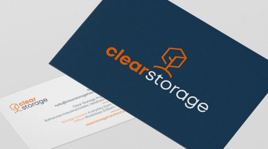
As part of this project, we began with an initial concept to create a distinctive, accessible and recognisable company name as well as a new brand identity, including brand assets. The result is a stunning complimentary orange and blue colour palette and branding. Other branding materials were designed as part of the project, including key fobs and business cards.
We were at a bit of a loss as to how to visualise and create our brand for Clear Storage and Reech did this excellently creating a brand that encapsulated our business as well as the values we wanted it to portray. They helped us to establish Clear Storage as a stand-alone company.
It has been a great project to work with Reech on, and we now have a smooth, fully functioning and informative website for prospective clients to search for as well as an amazing brand. We have been very happy with the work produced.
Ali Goodwin, Office Manager at Clear Storage

