Reech evolve historic Nock Deighton brand
We’re delighted to have evolved Nock Deighton’s iconic brand.
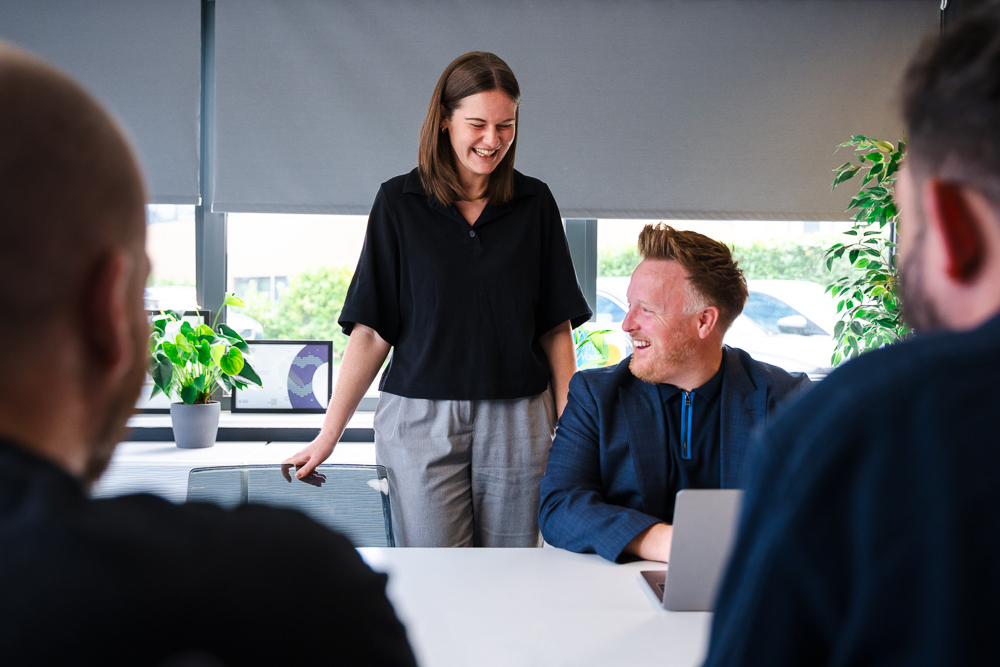
Our design team has been working closely with one of the Midlands most well-established and respected estate agents, Nock Deighton, on a rebranding project. As part of this project, we also designed a variety of accompanying materials and assets that the client can benefit from across their offices.
Nock Deighton has over 180 years experience in residential sales, letting property, surveys and valuations across Shropshire and Worcestershire, priding themselves on exceptional levels of service and knowledge of the sector as well as the local area. Having built a great reputation for professionalism, expertise and customer service, they felt it was the right time to update their branding to reflect their future-facing business model.
As part of this relationship, we were tasked with modernising the Nock Deighton brand, whilst ensuring that the heritage remained. The Nock Deighton brand is well-recognised in the industry, so our design team were conscious to enhance the brand’s existing signifiers – such as their core colour and serif typeface – to ensure that the heritage and reputation were not lost.
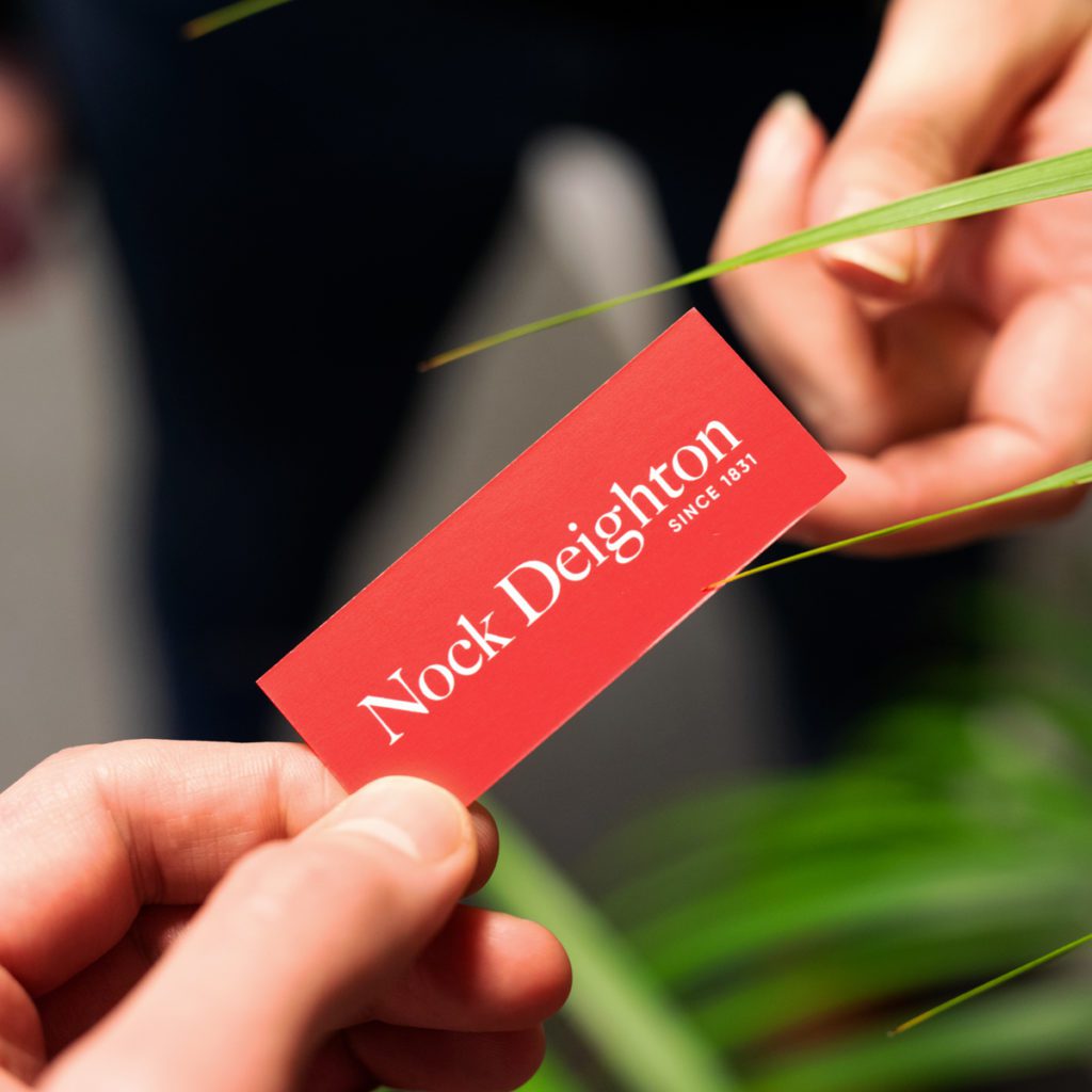
We worked sympathetically to bring the brand up to date and the design team understood it was paramount to ensure that Nock Deighton remain easily recognisable within a competitive market. We refreshed the colour palette from burgundy to a punchy, bright red. This revised logo and colour palette were then incorporated into the rest of the branding outputs.
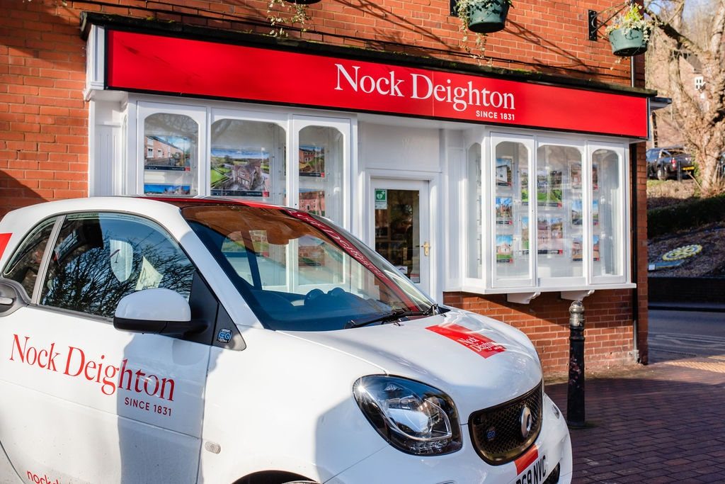
We then rolled out the new branding to all seven offices located in Bridgnorth, Telford, Newport, Ludlow, Ironbridge, Cleobury Mortimer and Kidderminster. This included marketing materials such as:
- Office signage
- Sales boards
- Vehicle wraps
- Social media graphics
- Office stationery
- Window display cards
- Corporate brochures
View an in-depth overview of our work for Nock Deighton.
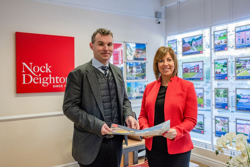
We’ve been working with Reech for over 6 months and we’ve been really impressed with their standard of ability, quality of services and the working relationship we have developed. We felt it was really important to get a fresh pair of eyes and perspective on our brand. The old logo was iconic a lot to a lot of people, so it was really important that the rebranding needed to reflect that. The team at Reech have been amazing and we’ve received really positive feedback. We look forward to rolling out our new brand across the company in the future.
Mike Nettleton, Chairman at Nock Deighton
It’s always exciting to have the opportunity to work with local brands that you’ve grown up. We are confident that we’ve done right by Nock Deighton’s rich heritage and given the company the tools to continue to grow. Projects are easy to work on when the offering is great: Nock Deighton’s exceptional service, expertise, and innovation are what has led them to be such a respected local company, all we had to do was reflect this in their visual identity.
Adam Preece, Head of Design at Reech
We have been proud to work with historic estate agents, Nock Deighton, in revamping their brand and rolling this out across a variety of marketing materials and brand assets. The design team worked closely with our client to produce a refresh of this brand that would not only modernise their appearance but would continue to grow its reputation. We look forward to working with them in the future.
Dena Evans, Creative Director at Reech